Piloting an AI-native, UX-owned design system migration
I piloted a fully UX-owned, end-to-end process for a design system upgrade to Material 3 Expressive across Google Payments mobile apps and platforms, taking design system components from Figma all the way to production code using a process enabled by AI. This process saw me working as the sole contributor, with minimal intervention from engineering partners. The goal was to prove that a solo designer or a small team of designers would be able to own design system upgrades end-to-end with the advent of AI.
Background
Over the summer, I was a UX design intern on the Google Payments team. I spent the first half on feature work, then moved onto the Payments design system team around the midpoint of the internship, where I got the opportunity to bring my engineering and design background together to work on a design-engineering workflow.
Google Payments is moving its apps to Material 3 Expressive, the newest version of Google’s design system. Redesigning every screen at once isn’t possible, so we start with the common components every screen is built from.
Material 3
- Button group
- Progress indicator
- Shapes
- Loading indicator
- Toolbar
Material 3 Expressive
Button group
Progress indicator
Shapes
Loading indicator
Toolbar
After some initial discovery work, I broke down how a design system component is migrated today into six steps: audit and scoping, investigation, design, implementation, review and rollout. UX and engineering each own different steps, so the work keeps passing between them, which makes it a slow and long-winded process.
My role
I came up with the pilot and ran it as a designer on the Payments design system team, taking design system components through all six steps on my own, instead of passing them back and forth with engineering. Engineers only came in at the end of the process, to review and approve the pull requests.
Key contributions
- Piloted a fully UX-owned, end-to-end design system upgrade processTested it on the Material 3 Expressive upgrade across Google Payments mobile apps and platforms
- Designed and documented multiple componentsBuilt Expressive components in Figma, with their specs, properties and guidelines
- Owned the code implementationTook components through code, engineering review and production rollout with AI agents
- Built AI tooling to improve the codeAdded to the team’s growing collection of AI skills, playbooks, tools and knowledge bases that AI agents refer to, so each iteration of our UX and design-engineering practices builds on the last. My component migration playbooks helped cut engineering review comments from 32 to 1
Proposed process
I proposed a new process where UX owns the whole migration, using AI as a tool to take on engineering’s part in every step apart from the final approval. AI helps to speed up the work, while the decisions, checks and fixes remain with the designer.
- reduction in steps that depend on an engineer
- 75%
- reduction in steps that depend on an engineer
- reduction in engineering review comments
- 90%+
- reduction in engineering review comments
For this case study, we use the menu component as an example. Here’s how it went through each step.
1. Audit & scoping
With AI, I could understand the menu’s architecture and find every use of it, without waiting on an engineer.
The first step is to find out where the menu is used today, and how it’s built in code, so we can plan how to replace it without breaking anything.
Before AI, designers didn’t usually work in the codebase, so finding out about a component’s architecture and use cases meant asking an engineer, then waiting while they searched through the code by hand with manual tools.
- 1UX: Asks an engineer where the menu is used
- 2SWE: Searches the codebase
- 3UX: Gets an answer, then has the next question
With AI, I could ask internal agents to scan and break down the codebase and bring out the important information, which allowed me to make decisions based on the live code and its current implementation.
tell me how the menu component is currently being used in GPayThe agent handled the searching, but I still had to decide what to ask it and make sense of what it found. From there, I scoped the migration by working out what the standard use cases were, which ones were custom, and what the new menu needed to support.
2. Investigation
With AI, I no longer had to note down every spec by hand, since it could read them straight from Figma. Of course, I still did my due diligence with some manual checks against the Material guidelines.
Material publishes standard guidelines and specs for its common components, but every platform has to study them to decide how best to adapt each one for its own use cases. Next, I did this for the Expressive menu, to decide how to adapt it for Google Payments.
This meant reading Material’s guidelines and the Figma component library, notating every spec by hand.
The agent can read Figma files directly through the Figma MCP server, so it could pull out the menu’s structure and measurements for me. This made the process a lot faster, but it is still necessary to check every value against the Material guidelines and decide what to keep and what to adapt for Payments.
use the Figma MCP connection to understand the component structure of menu3. Design
For now, AI couldn’t help much with the bulk of the Figma design because of internal policies and safeguards. Ultimately, this is still work that requires human design and visual craft.
Designing a component requires an eye for detail, consistency, and the context needed to get every part right, which AI can’t fully replace yet. So after the audit and investigation, I built the menu in Figma from the ground up, starting from the Material team’s design and adapting it to the use cases we found in Payments. I then documented its specs, properties and guidelines.
Atomic design
I built the menu using atomic design principles, starting from the smallest elements, such as the slots for icons, labels and badges, then combining them into item states, groups and finally the full menu. This way, every variant comes from the same set of parts and stays consistent.
Specs and guidelines
I then documented every measurement, colour and usage rule, so that the new build has one dependable source of truth. Along the way, we made Payments-specific decisions where Material’s defaults didn’t suit our product line.
4. Implementation
With AI agents, I could turn my Figma specs into production code myself and see my work running on the actual platform.
Next is implementation, a step that used to belong only to engineers. Once the design is done in Figma, the same component has to be built 1:1 in production code before it can ship on Google’s mobile platforms.
This is usually where UX hands the design over to engineering, and waits for it to be built.
- 1UX: Hands off the Figma design
- 2SWE: Builds the component
With AI, I could turn my design into that code myself, prompt by prompt, and see my work live on the staging build.
based on the menu component I have built in Figma, can you start a changelist to implement it in codecan you also implement the component in the developer settings demo pageThis took many rounds of prompting. I built the component up change by change and reviewed everything the agent wrote against my Figma spec. Whenever it got something wrong, such as using Material’s default tertiary colours for the selected state instead of our secondary ones, I would catch it and tell it exactly what to fix.
Making AI code good enough to ship
The answer is reusable tooling: skills, playbooks and a growing knowledge base that the agent refers to every time, so each iteration of our UX and design-engineering practices builds on what was learned from the previous one. AI still has its shortcomings, but with the right tools in place, we can overcome them much better than before.
It is also how the pilot can scale to more components. Every playbook and rule written for one migration carries over to the next, so each new component, and in future other design-to-code work such as new features and screens, can start from what the team has already learned instead of from scratch.
This is important because this is production code that goes out to millions of users. Engineers are responsible for its quality during review, and code that isn’t up to standard wastes their time, or worse, leads to bugs after release.
So as I went, I built up component migration playbooks, skills, and reusable AI tools, and added what I learned to the team’s knowledge base. Every fix that engineers asked for in review became a rule for the agent to follow the next time.
A huge improvement in UX-to-code efficiency and quality
Review comments fell from 32 to 1. Before any code goes live in production, an engineer has to review and approve it through a pull request, where reviewers leave comments on anything that needs fixing. Engineers left 32 comments on my first pull request. With the AI tooling and skills in place, my later pull requests came down to just 1 comment each.
5. Review
Checking the build against Figma still needs a careful human eye. Since I built the components myself, I could do the checking and the fixing on my own, instead of sending it back and forth.
Once it’s built, the component is checked against Figma, variant by variant, until it matches 1:1. This is called an implementation review. The designer compares the built component with the Figma design, screen by screen, looking for anything that is off, such as the wrong spacing, colour or corner radius, and marks each issue for the engineer to fix. It usually takes several rounds, and each round means waiting for the engineer to get to it.
The designer screenshots every screen and marks what’s off. It goes back to the engineer, and the designer waits to review it all again.
- 1SWE: Builds the component
- 2UX: Screenshots the build and marks everything that doesn’t match Figma
- 3SWE: Fixes each marked issue
- 4UX: Checks every screen again
Since I owned the code, I could go through this loop on my own: update the code, overlay the Figma component on the build, fix anything that doesn’t line up, and repeat, without having to wait on anyone.
add section labels with icons and dividers in the demo page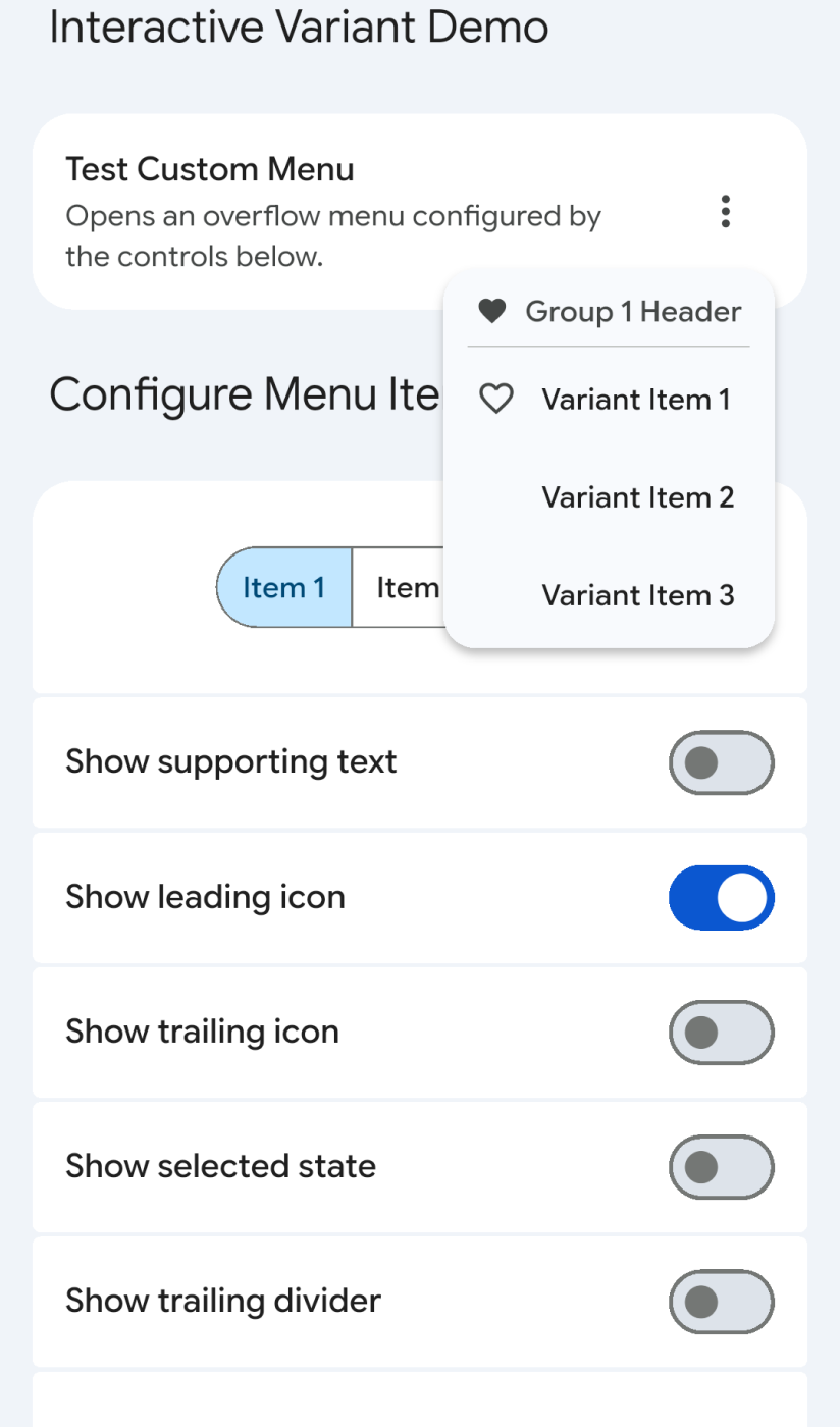
The agent makes the change and rebuilds the demo page.
Even the Figma kit can be wrong
Figma specs, and even the design system’s own Figma kit, can sometimes be wrong, especially when they are pieced together from other sources, so we need to stay mindful of them. While checking my build closely against the kit, I noticed that the kit’s own corners didn’t nest properly. I raised it with the design system team, who confirmed it was a bug.
Looking ahead
In the future, an agent could potentially do this implementation review and cross-check on its own, by taking screenshots of the build, comparing them with Figma, fixing any differences, and repeating until the two match.
6. Rollout
As mentioned earlier, an engineer has to give the final okay in a code review before anything goes into production. Everything before that was done by UX.
Finally, the production code is submitted, with its tests, and rolled out.
- 1UX: Signs off the reviewed build
- 2SWE: Writes the tests and submits the pull request
- 3SWE: Rolls it out to the apps
I built the code, the tests and the reference screenshots they check against. An engineer did the final review and approved it. If everything goes smoothly and our AI toolkit works as intended, that final approval (an “LGTM”, short for “looks good to me”) is all the engineer has to do.
- 1UX: Builds, tests and submits the pull request
- 2SWE: Does the final code review and approves it
Before a component ships, it also needs tests. One of the most important for UI is the golden screenshot test. It saves a reference picture, called a golden, of every state of the component, and whenever the code changes later, it takes a new picture and compares the two. If anything has moved, even by a few pixels, the test fails, so visual bugs are caught before they reach users.
Golden
Saved reference
New screenshot
After a code change
Difference
Test fails, fix before it ships
The skills and playbooks I built earlier also cover these tests, so the agent could write them and generate the goldens for every state alongside the code. This work usually falls to engineers at the end. Having it ready in the pull request sped up the review a lot and helped me build rapport with the engineers reviewing my work.
Final thoughts
My work at Google Pay sat at the forefront of how AI is reshaping design, and I got to hone my craft by owning a brand new, never-before-seen design-engineering workflow.
A design system has a lot of moving parts, which had kept the migration process stuck in limbo for a long time. I’m grateful that with AI, a designer like myself and others in the team could move the needle and genuinely show that UX can cover more ground. This project has left me optimistic about the future of design in a world of AI, and how AI might continue to enable us as designers.
Also at Google
A Figma plugin for design-to-engineering handoff. Built a plugin that catches accessibility and responsive issues before design is handed off to engineering. It saves about 5% of weekly engineering time.
32comments, on my first pull request